Overview
Well, 2 years of college is basically finished now. This is that last required post I have to do here, next year may have that requirement but that's going to be different. For data science specifically, my hunger games project should be done. Like web dev, there has been lots of change involved, but the core has stayed. Overall, it feels exiting to know things are finishing but also scary now that more unknown things are ahead for me.
What was completed
As I said, there has been decent amount of changes through the semester. I started with just continuing off my older project and trying to make it even better. However, I decided that I didn’t like it that much and wanted to start again. This was because I wanted to make it map based and more smarts than random fights for every player. I made the player be able to go and move to player or run away and other map based features because fanciness. I think I should have decided this earlier but that's the past.
Another reason I changed languages was so I could have web dev and data science similar and make use of the cool graph library (Tremor). It really makes things nicer and allows for interactive graphs whereas matplotlib doesn’t.
For a quick rundown my project is currently a game with many players inside 12 districts. Every year, they select some people to fight on behalf of them. Inside the fight game, they have to make decisions which are influenced by the best player in the previous year (or random if first). And the game goes on until only one district is left alive. The map system was kind of inspired on Civilisation but way more basic (ie just square tile and movement).
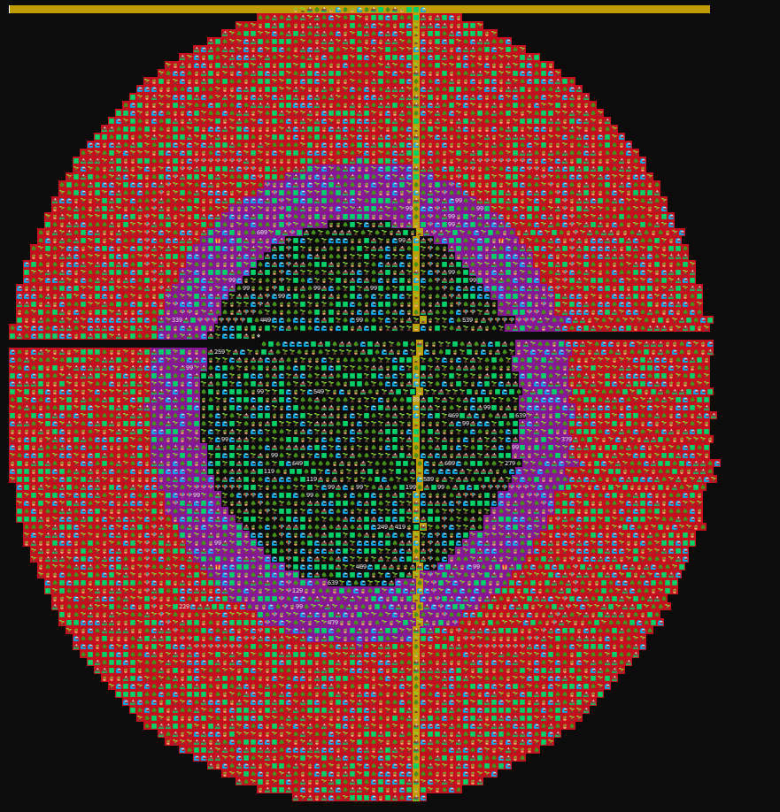
The 2 screenshots I will show are the outcomes of the project. This first one is the map to show how the present game is going. It goes through every tile on the map and prints it. It shows players but with health and the 2 yellow lines symbolise the current year and turn (X axis is year and Y is turn). There is also the death zone border symbolised by red, and the planned one in purple (where the players start running out of that). This does slow down the game heavily, but it is kinda cool to see, so I sometimes use it.
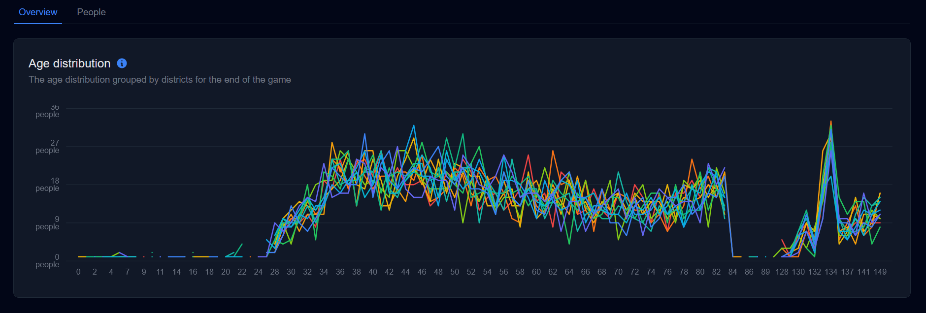
But sometimes you want to know the data afterwards, so that's why I made the data website. This takes the aggregate data outputted by the game and makes cool and sometimes unnecessary information. This example below is the first one I made so I will tell you about it, but basically it takes all the users at the end of the game and plots their age and grouped by districts. It isn’t the most important anymore, but it is cool to see nevertheless (was more useful earlier on).
There are also a few more graphs I have made but I will just list them out:
- age distribution by district (already discussed)
- the 4 changeable options on columns coloured by districts
- the top person leaderboard for all years (ie 11th)
- population per year by district – population/deaths/births
- and can be viewed at: https://michael-schoo.github.io/Hunger-Games-v2/
Overall, this was a cool project and I learnt lots about OOP and how to make cool graphs. There are many things that I can improve upon, but I should be talking about my result. I know at there is probably lots of unnoticed things that I spent time on (making a circle map was fun but slow) but these things are what gave me motivation to continue doing it. Also, the real time map was meant to be for debug, but I liked it so much I kept it and going to show it off in my project.
Reflection
How would you change things if you do it again?
I can think of many things I would change if I could do this again. The first thing would be is to implement the purpose earlier. This means do the pathfinding and genetic algorithm way earlier and deal with more unnecessary things in a future time. This makes it so I could have a better implementation instead of “rushed”. Another thing I would do is maybe add more unique things like backpack for storing items. This would add a whole other aspect on the game and add interesting complexity. And finally an important thing could be to make this playable, but kind of going a little far for this specific assignment.
What was the highlight this semester?
There were many highlights this semester. Learning about other’s projects were always interesting. This includes testing them and trying to understand how they did things. It was also very cool showing my project to others too. That was because I am proud of my cool app, so why should I keep it to just myself (I didn’t do it often as they had their own thing to do). However, the coolest thing is knowing I’m about to finish school… wait am I ready for that yet?
What do you think you will do with data science in future?
My future in data science isn’t going to end yet. I plan to still analyse things; an example is making a website like said in web dev. It is a kind of broad topic but won’t stop programming and might even make this into an actual game. Playing with data has always been interesting for me, but it was always better when I could be creative with it. But the most immediate thing is my project which is in a week.