Overview
For the last time, welcome back to my weekly reflections. At time of submission of this post, my assignment would have been due and I should have submitted. I will talk about the process of getting to this point and some things I will talk about in my presentation. There have been major changes from initial idea to final, and I am mostly happy with it. There are many things I had wished I included, but I can’t have everything.
What was completed
At the start of the semester I looked at my previous assignment and wanted to do something similar but different. I decided that a shopping website where people can list items they want to sell and then have a way to purchase them sounded cool. After some time, I did decide to shift focus to just listing anything. This made the importance of a chat even more important as how else are the 2 meant to communicate? I mean they could send emails to each other, but this is cooler.
The other UI changes I did was shift from Boostrap to Tailwind. However, as I am not the best for designing initial layouts, I used chadcn/ui to get basic styles such as button and built upon that. This meant I used a little more “templates” than before, but there was nothing saying I can't do that. I also chose to use React so that I can make these reusable components without code duplication (in Flask I had a lot). But a very cool feature of this new iteration was that I hosted it online and allowed anyone to sign up (with email sending and Google OAuth): https://online-store-michael.vercel.app
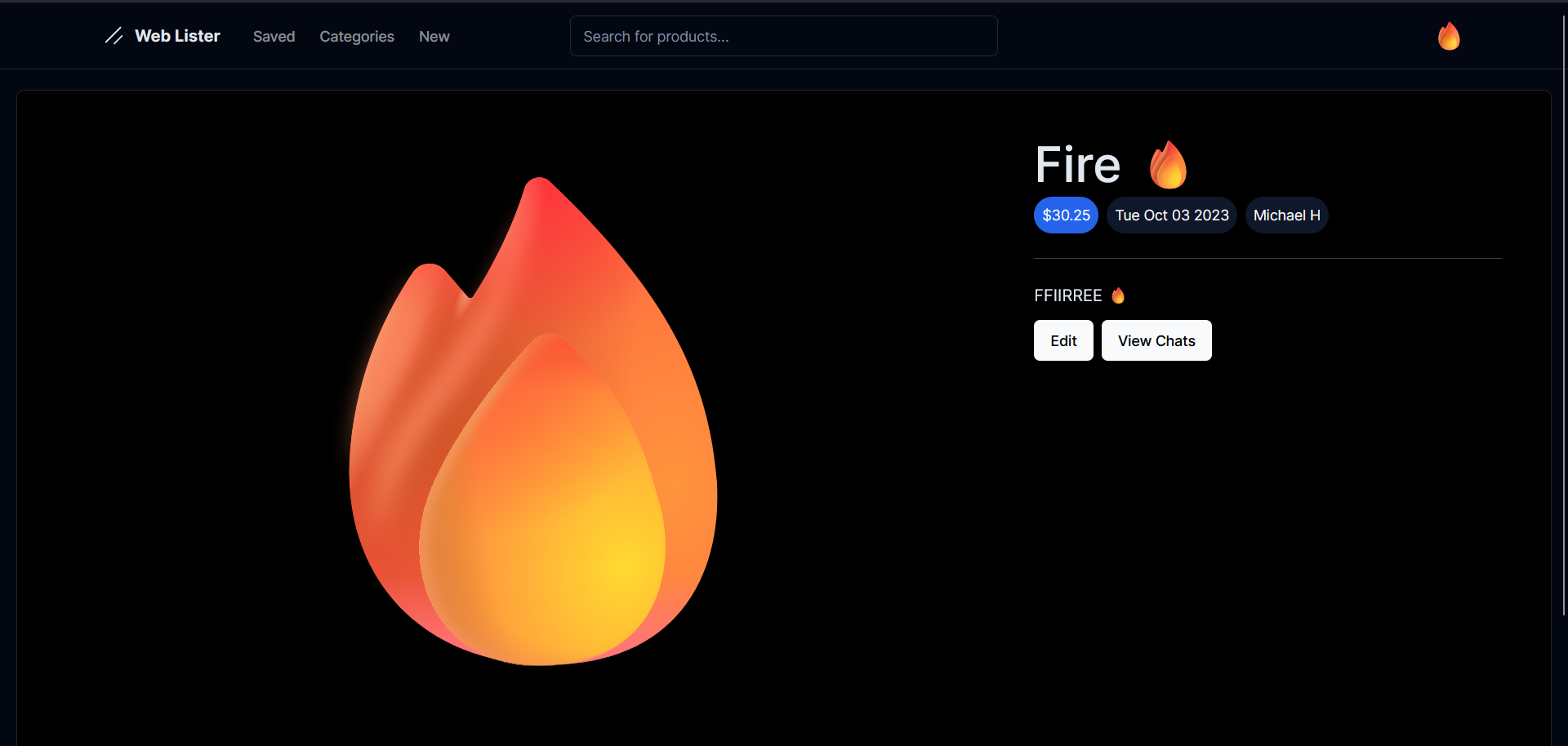
Now for some screenshots so you know some things about the project and what I might use in my presentation. The first thing would be the listing page. This is a very important thing as it shows to everyone what your product is and why they should get it. The image is large because that is one of the most important things. There is the description slot next to that because more context is always useful. It does make sure to show the name, price, data created and user as “metadata” because it seemed cool and useful. The buttons would be different for weather you are the poster or a normal user or not even logged in.
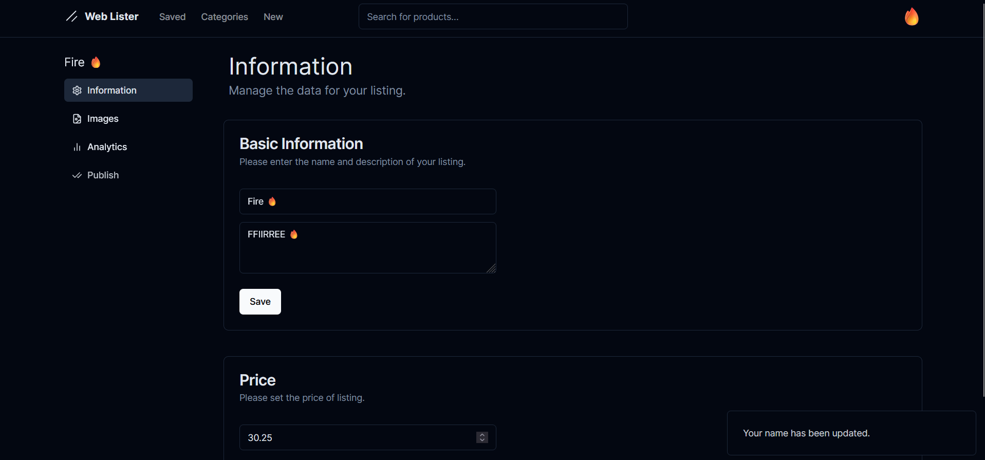
Now another useful page is the edit page. This houses the place to change the listings title, description and price. But it doesn’t stop there because there is a way to add images and publish it to the whole world (it isn’t published by default as it may not be finished on creation). Now once it is published, there is a “analytics” tab to see how many people accessed your listing each day. But I have used the dashboard settings in many other places such as global settings.
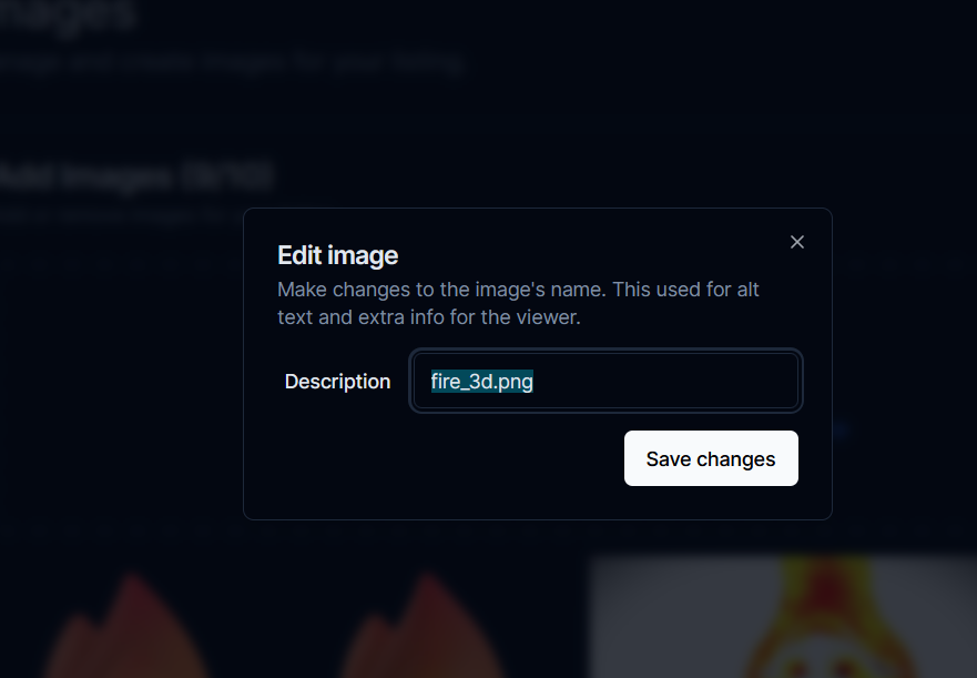
Now modals were cool and I just wanted to include them here as I could. This specific modal was used for editing the description of an image. As you may already know that alt text is important, I wanted to include it there. It is a way simpler way then adding a text box to the main page because of layout shifts. I currently don’t use modals much and prefer to use full scale pages but for really short changes it works well.
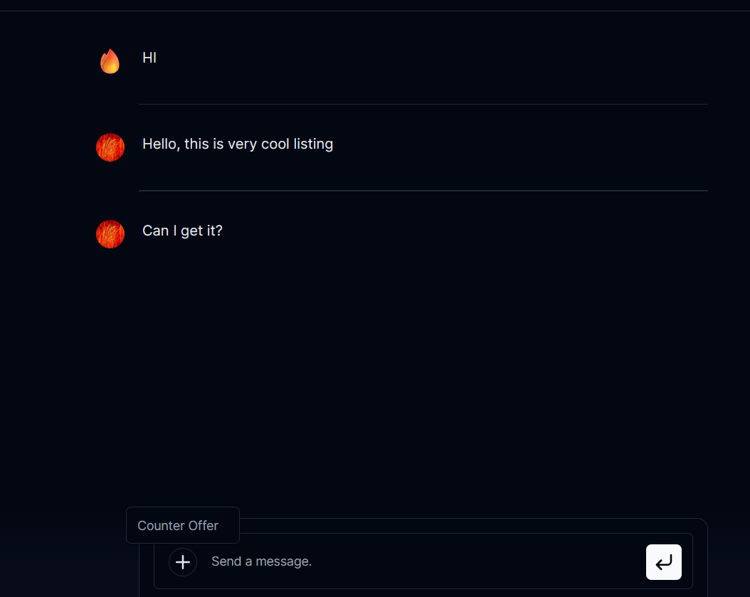
This final useful feature was the chat. It is the best way for 2 people to communicate in context of a listing. If they wish, they can give a better form of communication, but I believe this is a good UI. There is even features such as “counter offer” where it opens a modal for the user to select new price. This should then make a nice embed for the poster to decide he they like and accept or ignore and reject.
Reflection
But your plan did change decently?
As I discussed above, thought-out my weekly updates, I have shifted the focus. At the start, I wanted it to be more of a store (which is why the URL name has that), but over time it just changed. This was because I was learning about what I can do, and I kind of realised that focusing less on money would simplify things more and I can make better UI’s in other places. The site was never going to be for actual payment, and I believe I have made it better by going a little further way from that (but I still kept listing price and buying).
Did you have fun this semester?
Yes, this semester was fun! It was fun to create the listing site. It was also cool because I got to learn about hosting online and the added complexities involved. Learning more UI was infuriating because UX is hard, but it is exiting seeing the outcome. And the new cool framework added fun too. I got to play around with emails which I haven’t done before, and I believe they turned out good.
What are your future goals in web dev?
Lots of my future is going to be based on what I do next year, but I do plan to continue with web dev. I considering making some more websites, but way more basic. Something I have thought about is a form site because I can do graphs again and it is decently simple. I also want to learn about security and how to minimise it even more, I already learnt lots in this project and plan to learn more. Before I can do these I have to finish my presentation, but that shouldn’t be too hard (at least to pass).